Button exercises


Buttons in various shapes and sizes, 2022
Interactive buttons; 200 x 200 pixels
A variety of choices are made to communicate mood in UX/UI design. I was challenged to think beyond the shape, size, motion, and color of traditional interactive buttons through prompted moods. Prompts included suggestions such as aggressive, loud, fast, shiny, magical, whimsical.
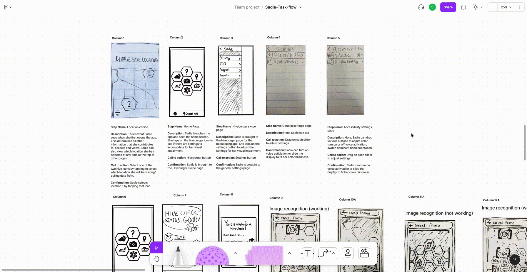
DataBuzz

DataBuzz, 2021
Interactive application; 375 x 812 pixels
Designed in collaboration with Isabelle Bailey, Bali Ong, Cassandra Colin, and Nanee Henry.
Inspired to resolve a user-specific problem through crowdsourcing, I collaborated with four other students to build "DataBuzz," an app designed to aid visually impaired beekeepers through photo recognition software. As other users input data from their own apiaries in the community, the app is able to identify different types of pollen collected and the life stages of bees in our users' hive.
We utilized various methods of design thinking and research methods (Benchmarking, Personas, Pain Points, User Journey Maps, Scenarios, Task Flow Analysis, Wireframes, User Testing, Naming, Branding, Lo-Fi Prototypes, Hi-Fi Prototypes, and an Explainer Video) to come to a conclusion while crafting an aesthetic that has visually impaired users in mind.
How did we arrive at this conclusion?
After learning about our user, Sadie, our team began benchmarking her day-to-day activities through her user persona. Through this, we could identify pain points in her user journey map. The group recognized that the highlight of Sadie’s day was spent outside with her apiary. Her pain points included frustrations identifying pollen in her hive and her disconnect in the greater beekeeper community. From this information, we drafted a scenario for our app.

A scenario for Sadie:
Before her weekly hive check, Sadie remembers mysterious brown pollen that she saw in her apiary last week. Sadie has a visual impairment called deuteranomaly, a subtype of color blindness characterized by the inability to distinguish green pigments. This could make it difficult for her to distinguish shades of brown and yellow as well as the subsequent stages of larva development in her hive. Sadie needs to recognize each stage of her bees’ life cycle, from egg to larva to pupa, to ensure the queen is laying eggs and that the hive is functioning. Sadie decides to download [insert name of app] that she heard about through a member of her beekeepers’ association. The app uses image recognition data to identify the offspring development of her colony and pollinators in her community.
Sadie sets up her camera stand, opens the app, and sets it to camera mode. She then suits up for her hive check, smokes out her hive, and pulls out multiple frames. The app recognizes each frame as she holds it up to her camera and captures an image for each frame. After receiving a message on her watch that the app has collected enough data, Sadie places the frame back into the hive and gently closes the lid. She can remove her beekeeper suit and gloves to see the data collected on her phone.
As Sadie reviews the data, she notices that the app has recognized her queen bee safe in frame 8, the percentage of bees in various life stages, and how many she can potentially sell to a farmer in California. The app also classifies the pollen color to be collected from a Joe Pye Weed in her neighbors’ yard. Sadie can complete her hive check with confidence and awareness of her hive. She can also check community trends to make sure she is doing just as well as her friends in her beekeepers' association.
From sketching to task flow analysis
From this scenario, the team was able to begin a task flow analysis. After sketching on paper, we shared ideas for different frames in FigJam.
Wireframes and early prototyping
Before diving any deeper into creating content, our team was able to execute wireframes. This step encouraged the team to discuss button placement, expanded page layout, and more.

User testing with expert beekeepers
Our next step was to begin user testing to identify areas of the interface that most regularly frustrate and confuse people. We located local beekeepers and a few design professionals to test with Figma Mirror.
Our team was able to record notes taken audibly, video recordings, and observation to recognize areas for editing. With this in mind, we were able to prioritize, fix, and retest before moving forward with our app.
Click the thumbnails below to read a few of our observations.


Naming and Branding
In all design, we use branding to leverage our identity. For this app, we emphasized how branding could differentiate ourselves from the competition, build awareness, extend customer loyalty, and make an emotional connection. We worked together to name our app before we each ideated different logo ideas. As a team, with influence from our beneficiaries, we decided on DataBuzz. Our final logo design was executed by Isabelle Bailey.

Lo-Fi and Hi-Fi Prototyping
With a completed logo and iconography designed, we began prototyping the app even further. With design thinking in mind, our team wove back and forth in a non-linear process to continue conceptualizing what would become our final design. This included many discussions on type hierarchy, accessible color palettes, and error messages.

Explainer video and conclusion
We utilized Figma Mirror to record a walk-through of our app centered around our user, Sadie. By solving for the specific needs of Sadie, our team was able to design a better experience for the greater beekeeping community to benefit from.
Risking the Physical and Digital Experience
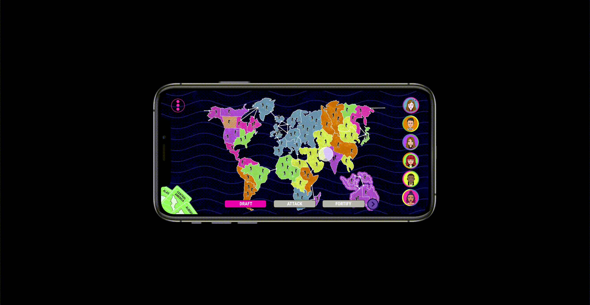
Risk redesign, 2021
Interactive application; 375 x 812 pixels
Designed in collaboration with Cailie Golden, Twila Bouldin, Shanna Smith, and Nanee Henry.
Those familiar with the board game Risk are aware of how many moments of delight can arise in a game of diplomacy, conflict, and conquest. Some of these experiences, unfortunately, do not translate to the mobile game of the same title.
How can the digital experience of playing Risk feel more physical? Within the assigned context, how can the UX/UI be improved when playing Risk digitally? These open-ended questions were designed to challenge the class to think beyond the playing board.
Working to build an interface as a team, this project allowed the class to explore multiple methods of design thinking (Wireframes, Lo-Fi Prototypes, Hi-Fi Prototypes) to come to a conclusion that would appeal to more users who identify as female.
